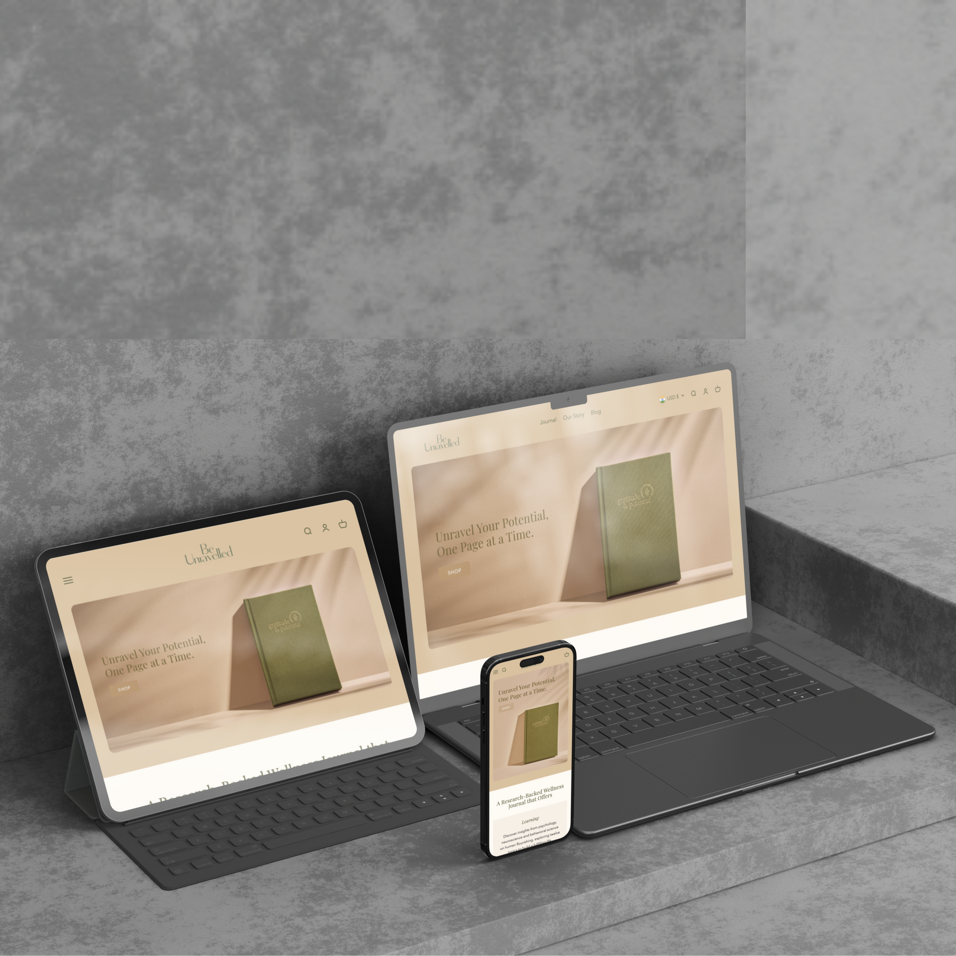
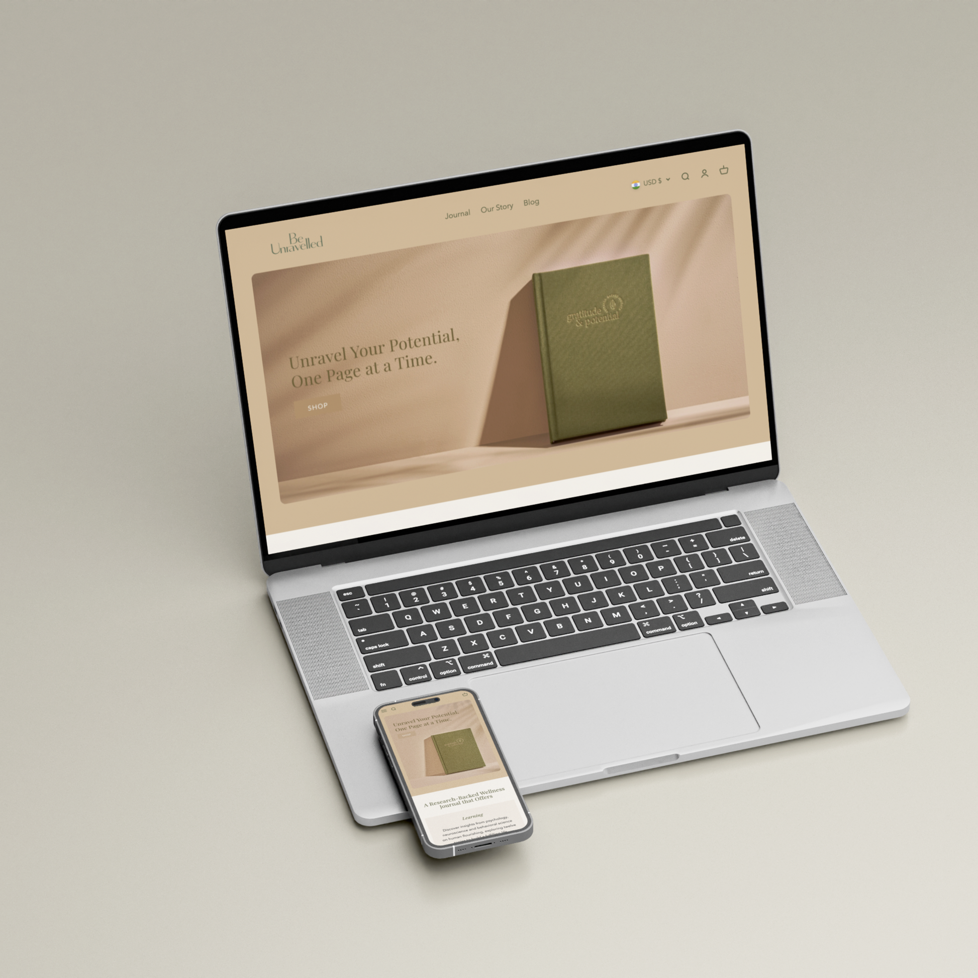

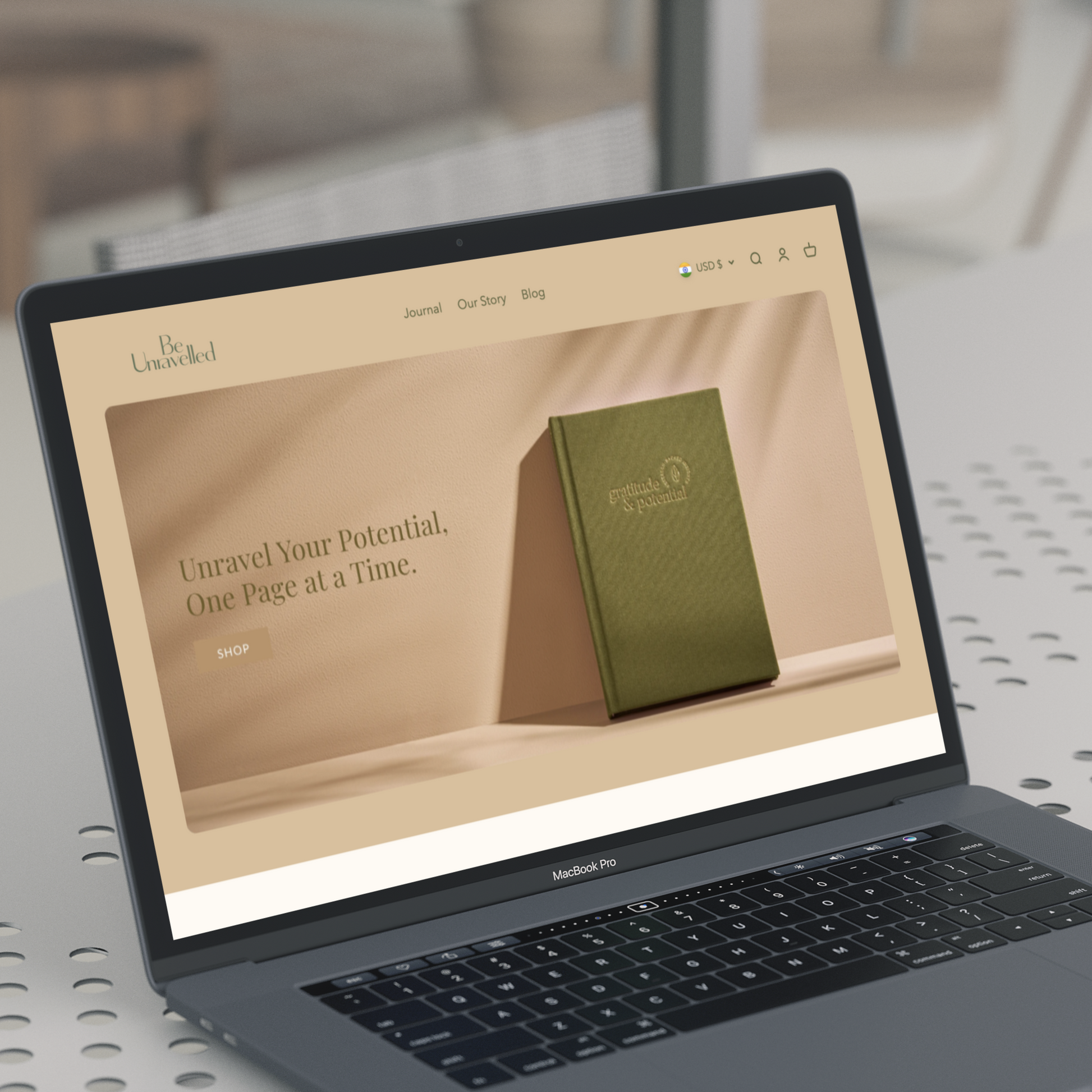
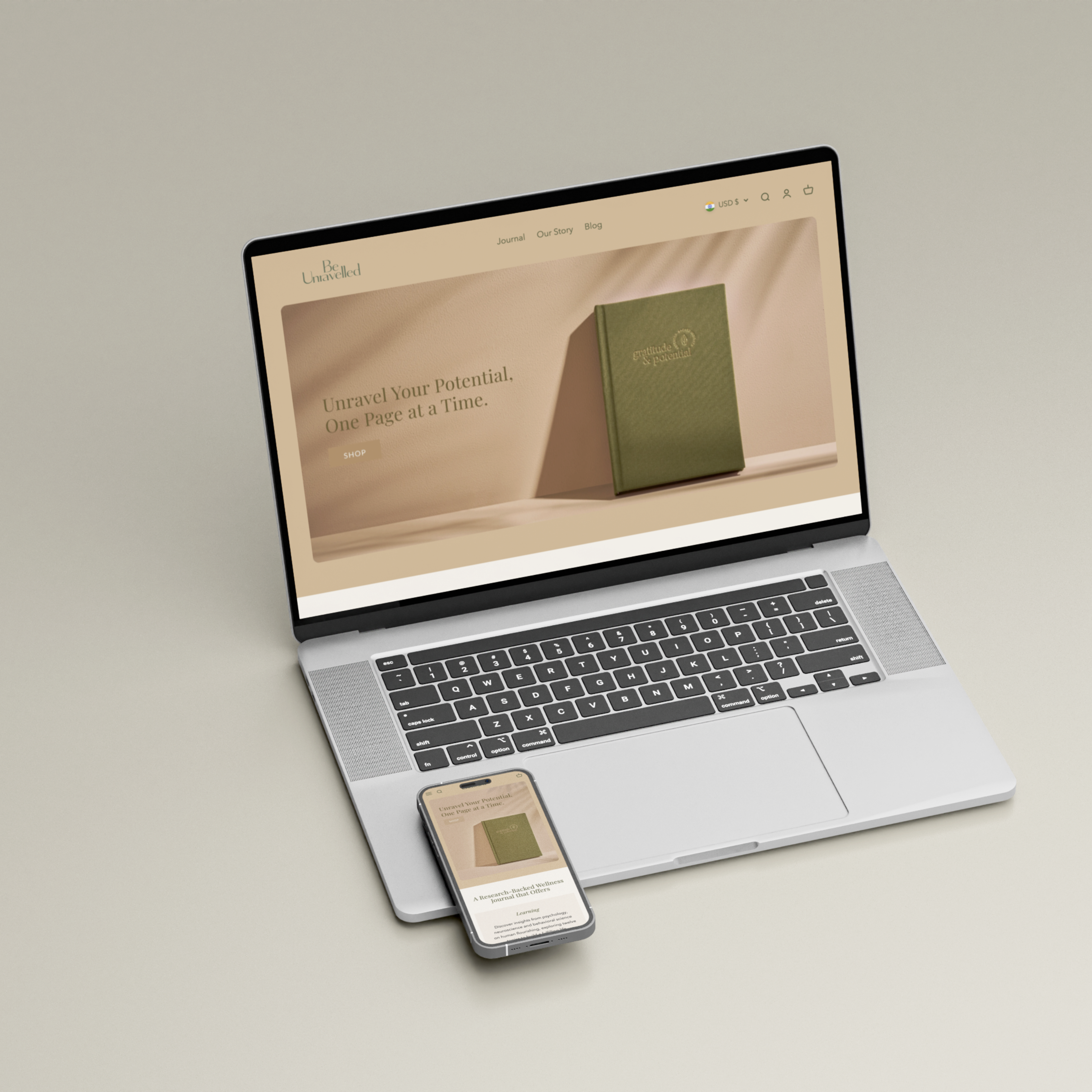
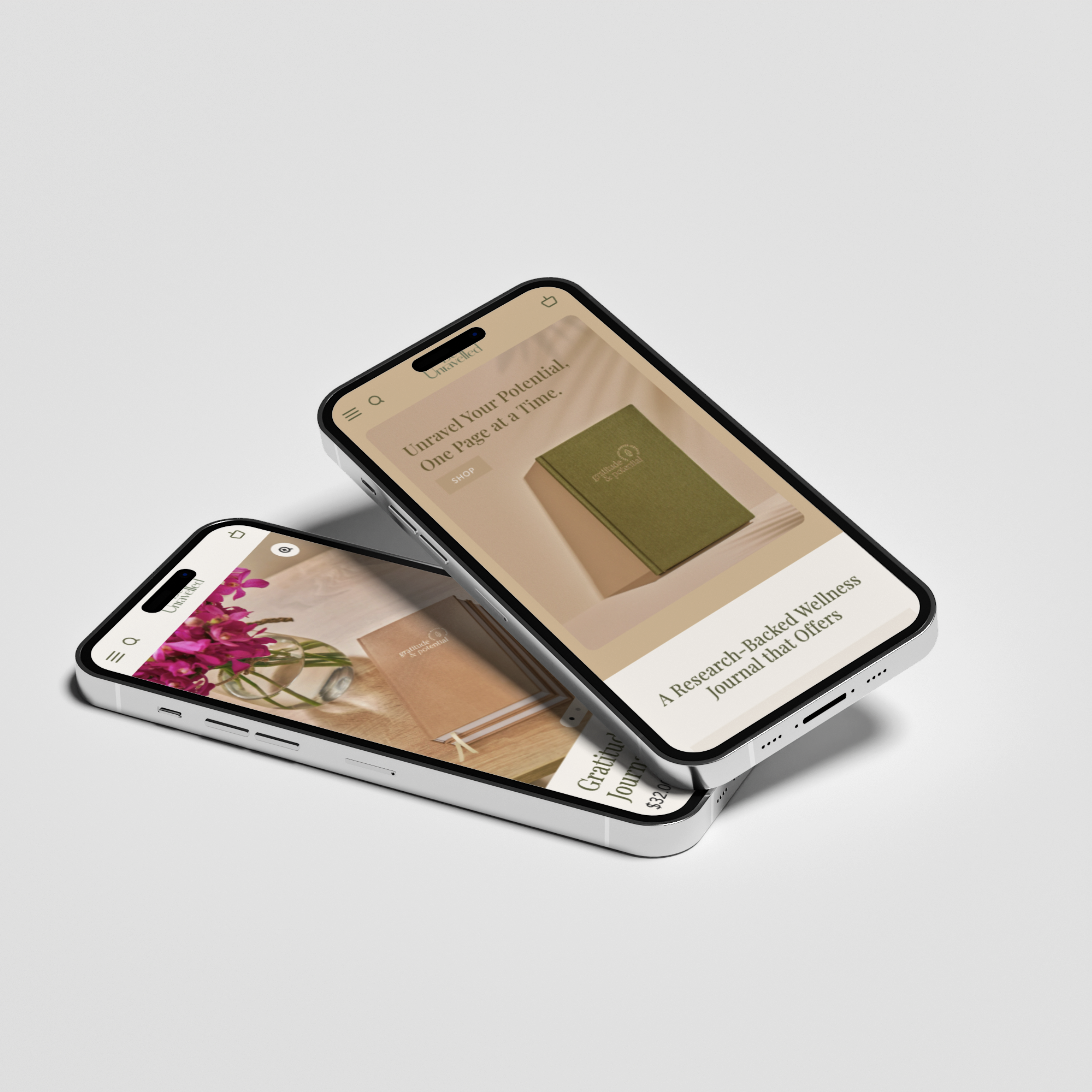
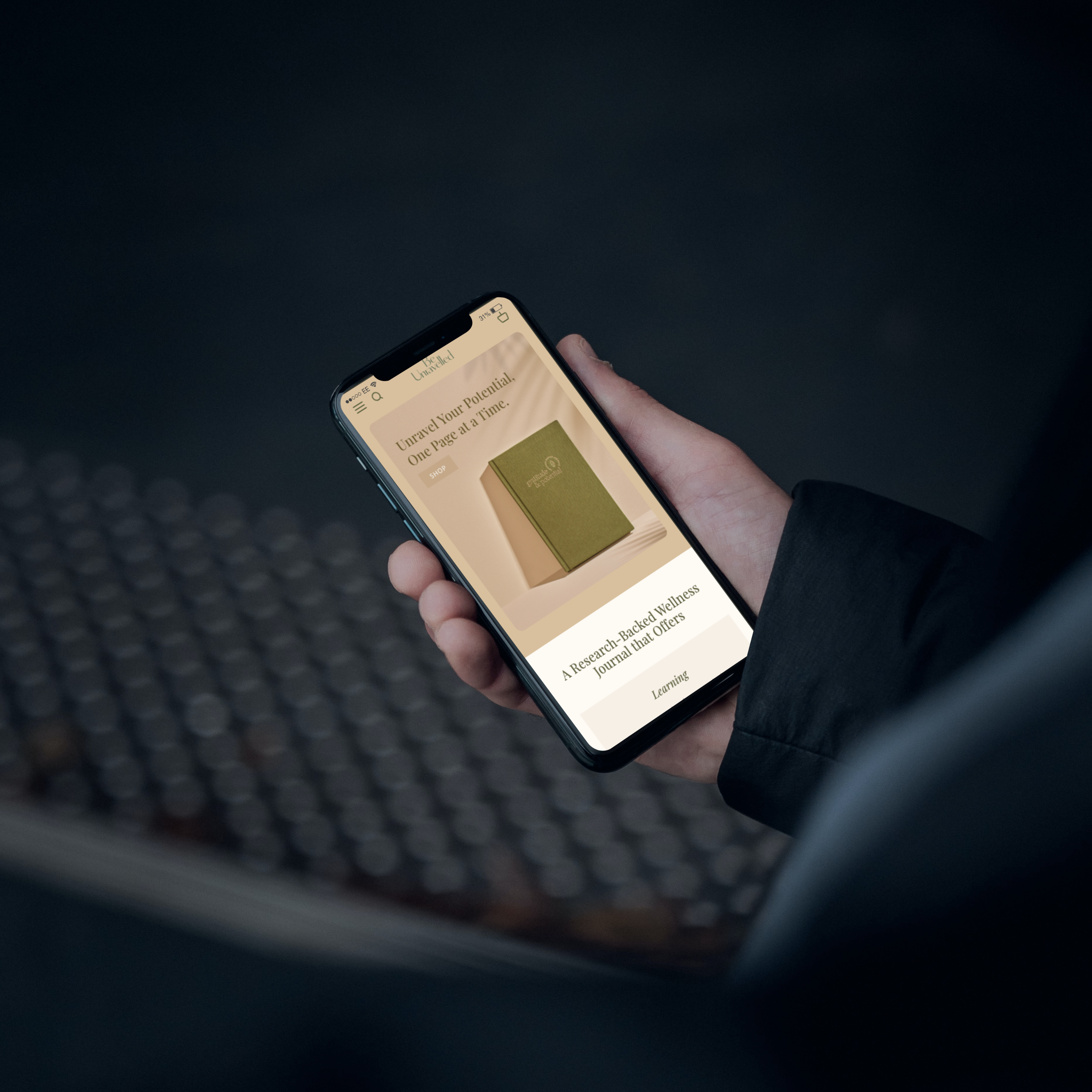
Be Unravelled
Shopify Solutions Offered:
Challenge
Be Unravelled required several refinements to align with the brand's vision, ensure a seamless user experience, and improve mobile usability. The key challenges included:
-
Inconsistent Typography & Colors – Some text was black while others were green. Headings and section titles had inconsistent colors.
-
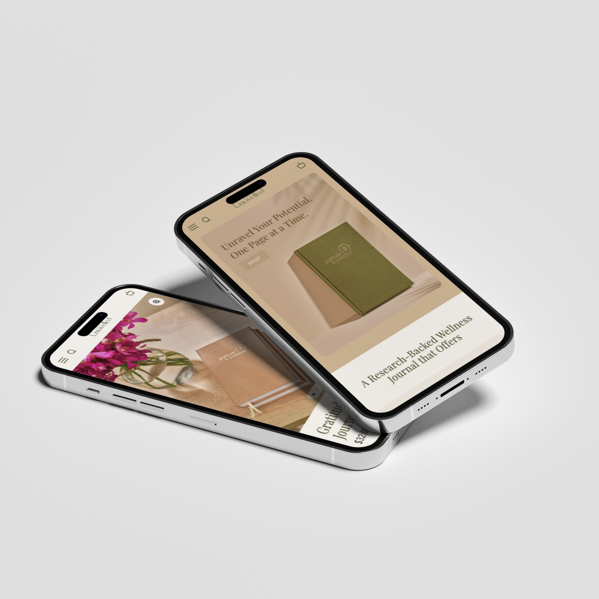
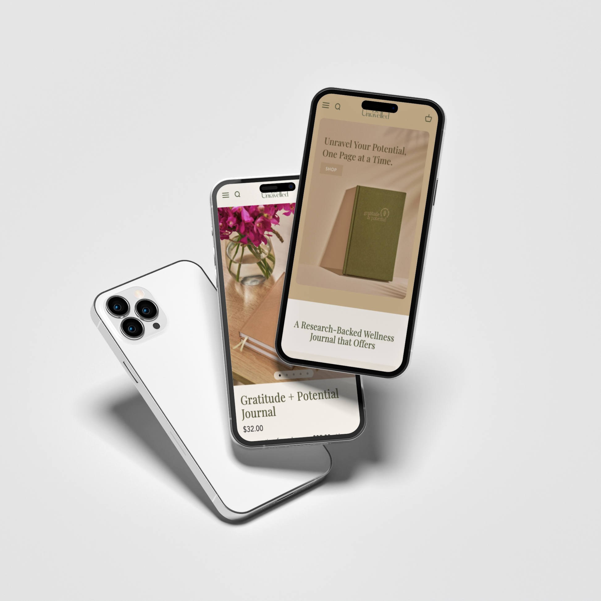
Mobile Banner Issues – The desktop banner was simply resized for mobile, making the image look zoomed-out instead of optimized.
-
Blurry Images on Desktop – Product images appeared low-resolution, impacting the perceived quality of the journal.
-
Typography Adjustments – The call-to-action (CTA) buttons needed to be in Lato Thin, and quote formatting needed adjustments.
-
Mobile Layout Issues – Several elements, such as Learning, Reflection, and Inspiration titles, were larger than section headers. Additionally, certain text needed to be split into multiple lines for readability.
-
Text Readability – Off-white text on some sections appeared too thin, making readability difficult.
-
Hotspot Text Issues – On interactive elements, the text was too small to read comfortably.
-
Footer & Navigation Updates – The footer needed to be simplified, and unnecessary elements (like "Powered by Shopify") removed.
-
Product Page Refinements – Better alignment, button styling, and clearer descriptions.
Solution
-
Standardized all headings, text colors, and button styles for a uniform brand aesthetic.
-
Created a custom mobile banner to ensure a properly scaled image rather than a resized version of the desktop banner.
-
Uploaded high-resolution product and homepage images to improve clarity on both desktop and mobile.
-
Applied Lato Thin typography to CTA buttons using custom code.
-
Adjusted mobile text layout by resizing section titles, ensuring text splits correctly for readability, and improving line breaks after commas.
-
Increased text contrast to enhance readability without disrupting the minimalist design.
-
Enlarged hotspot text on interactive elements and adjusted positioning for better visibility on mobile.
-
Simplified the footer by removing unnecessary elements and organizing links into "Quick Links" and "Resources" sections.
-
Improved product pages with clearer descriptions, better alignment, and updated button styling to enhance clarity and trust.
Results
The website now has a more cohesive design with consistent typography, improved readability, and a better-structured mobile experience. Product images appear sharper, ensuring a high-quality look and feel. The user experience has been significantly improved with better navigation, a simplified footer, and optimized text placement. Hotspot elements are now more legible, making interactive features more engaging. The overall effect is a modern, minimalistic, and professional website that effectively communicates the brand’s vision and enhances the shopping experience.