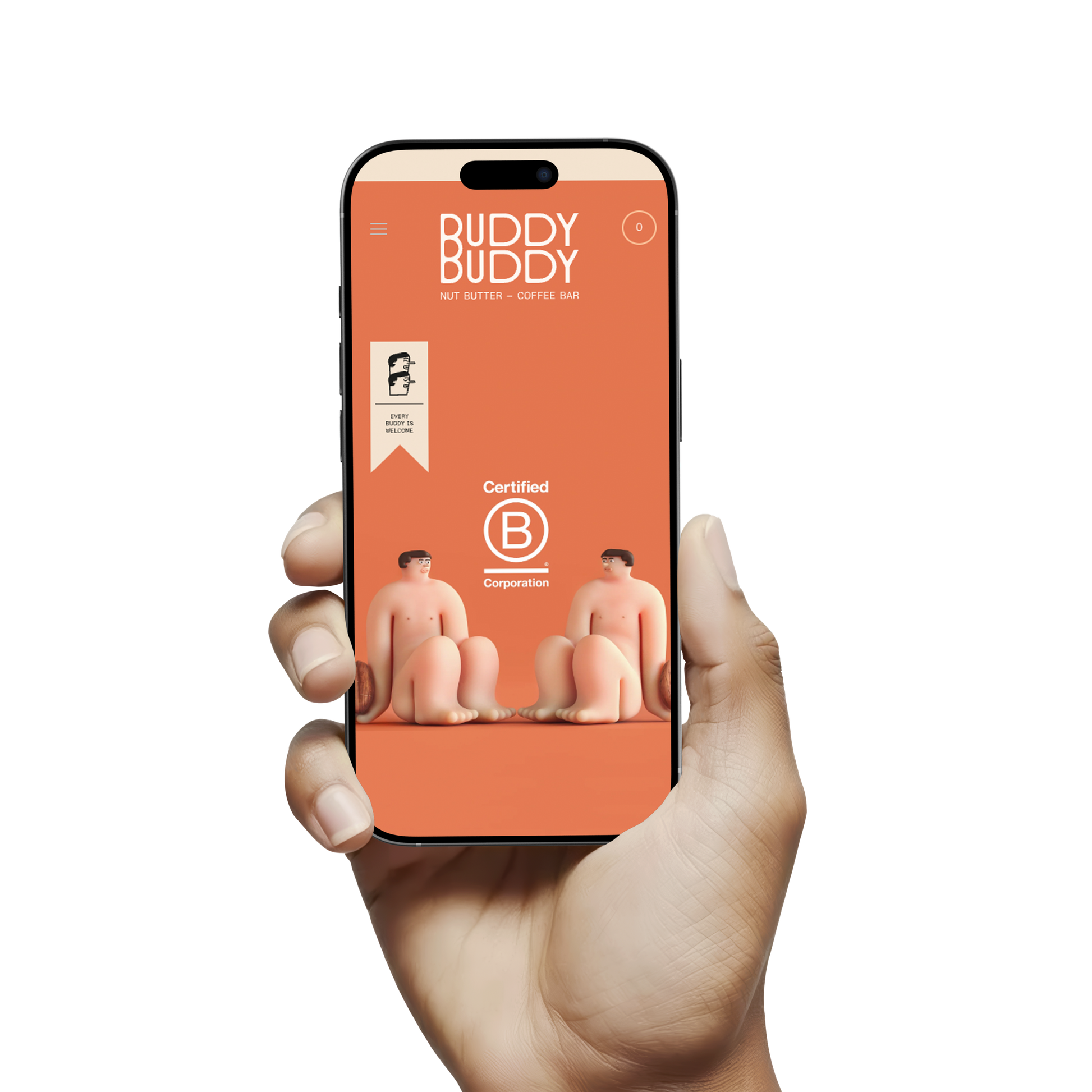
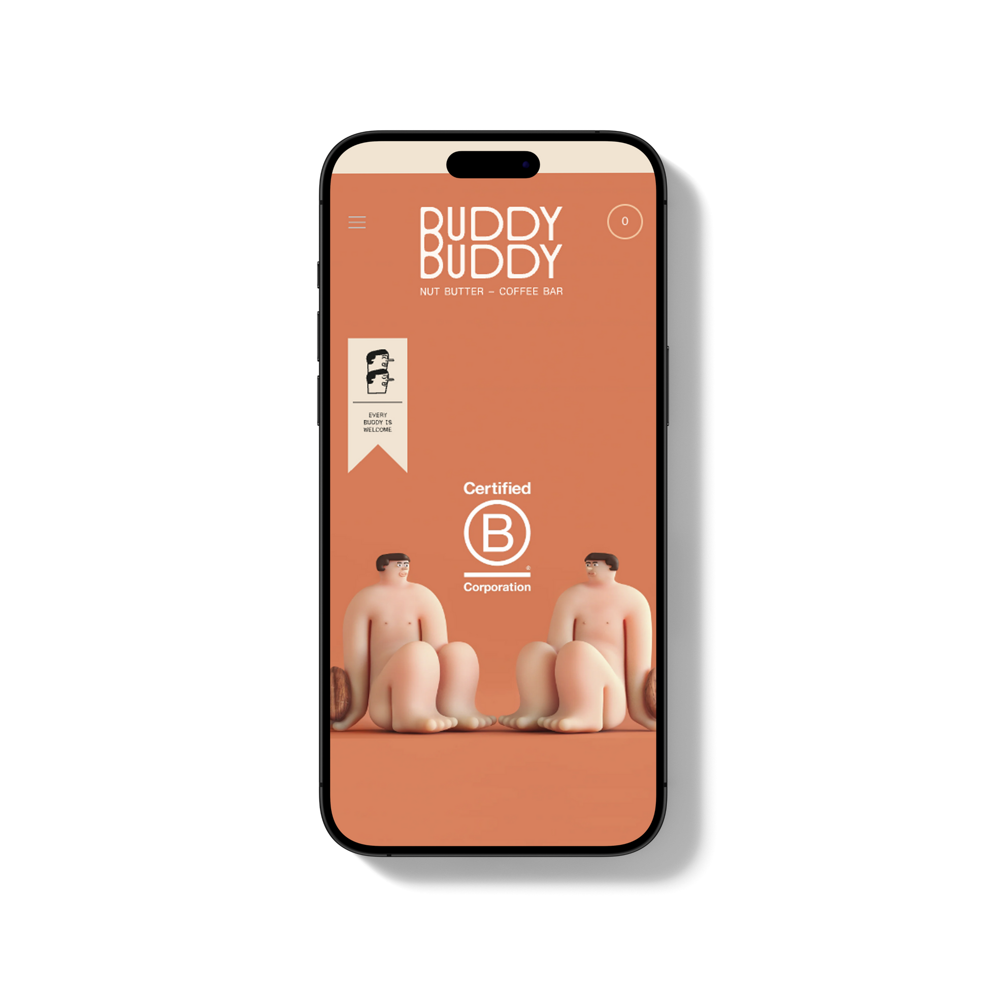
Buddy Buddy
Shopify Solutions Offered:
Challenges Faced by BuddyBuddy Pre-Revamp
-
Cluttered / Overwhelming Navigation & Menus
-
Multiple top-level menu items: Locations, Nut Butters, Shop, What Is It, Farm-to-Jar, Atelier, Stockists, Coffee Beans, etc. Without careful arrangement, users may find it hard to decide where to click first.
-
The presence of many non-product pages interspersed with shopping links (e.g. “What is it”, “Farm-to-Jar”, “Atelier”, etc.) could distract or dilute the path to purchase.
-
-
Homepage Hierarchy & CTA Weaknesses
-
As with many artisan food / café brands, the storytelling (origin, values, cafés) is vital, but it can compete with product promotion. Ensuring the right balance so users immediately see what they can buy is key.
-
The “Add to Cart” buttons and “Shop All” etc. need to be immediately visible / compelling so that impulse purchase behavior is encouraged.
-
-
Visual & Brand Consistency / Clarity
-
Imagery, overlays, fonts, color contrasts might vary across sections (e.g. hero banners, product listings, café vs webshop pages). For example: the hero image, product-photo styles, banner layouts.
-
Ensuring that the feel of the brand (premium, organic, artisan) is communicated coherently through design.
-
-
Mobile / International Readiness
-
The site prompts users from certain regions (e.g. from the U.S.) to switch to a different store — this needs to be smooth and clearly communicated.
-
On mobile, menus, CTAs, buttons, typographic scale, image scaling, touch zones might need enhancement to avoid user friction.
-
-
Performance / Load Speed Issues
-
Many high-quality images, multiple product variants, possibly heavy scripts for animations / “hero” panels. These can affect page loading, particularly for customers on slower networks or mobile devices.
-
-
Trust & Information Architecture
-
Important trust signals like shipping policy, returns, authenticity of ingredients (organic etc.), B-Corp certification, cafés locations need to be visible.
-
The “About / Story / What is it / Farm-to-Jar” pages are good for brand storytelling but might not be prominent enough on pages where users are deciding to buy.
-
Solutions Implemented by Pictonix: Revamp & Customizations
-
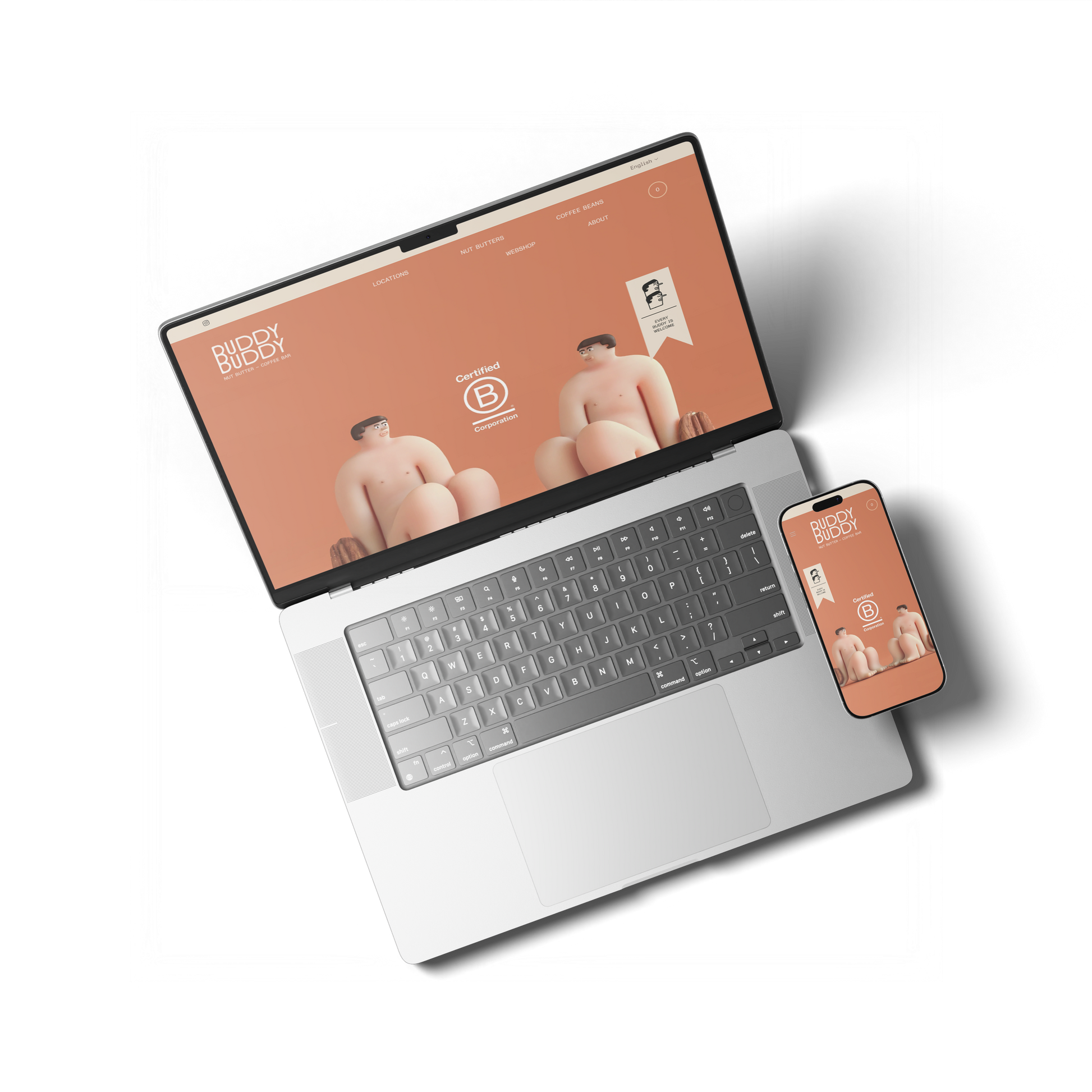
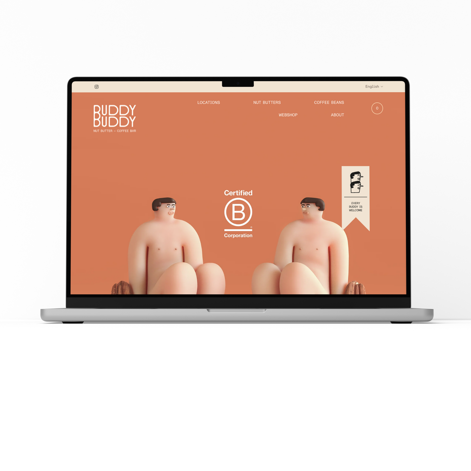
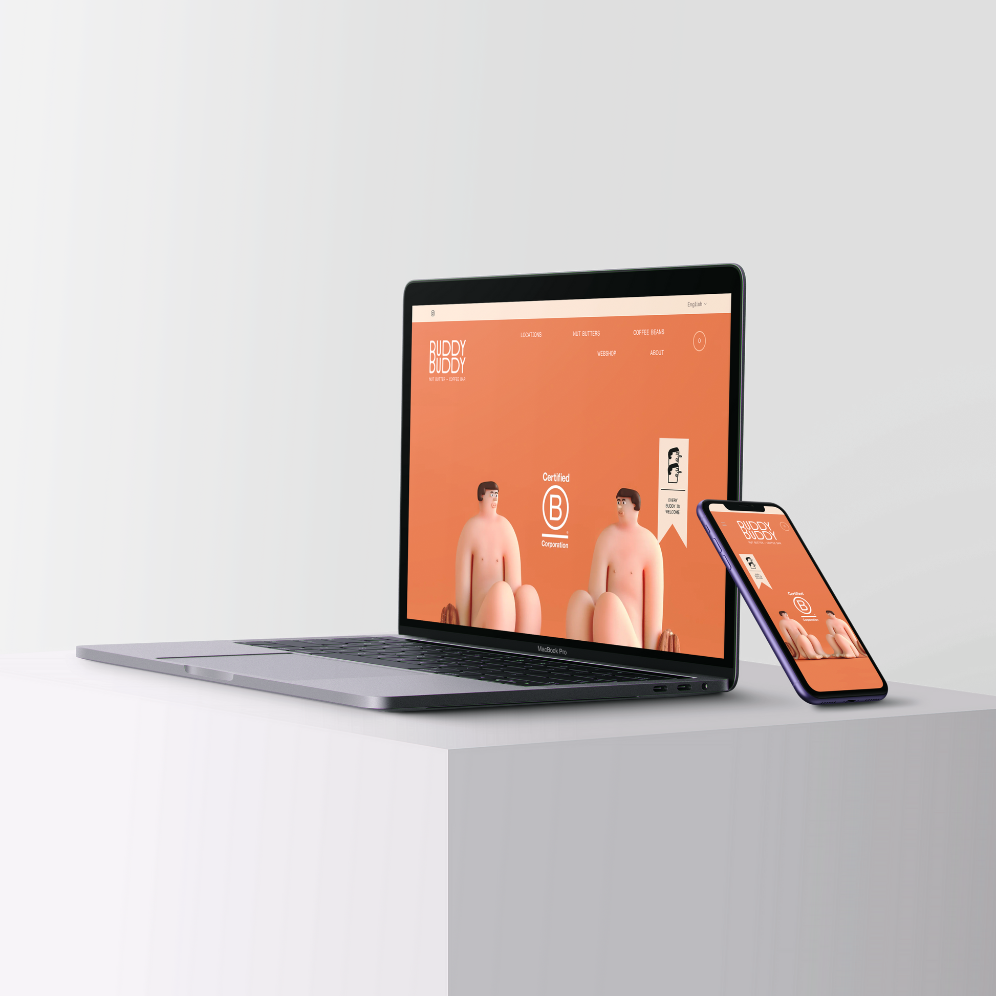
Simplified & Structured Navigation
-
Reorganized the top-menu: grouped or reordered items so that product shopping (“Shop All”, “Nut Butters”, “We-shop / Webshop”) is more prominent, while brand / story / café content is accessible but secondary.
-
Possibly used submenu grouping (for example: under “Shop” → Nut Butters, Coffee Beans; under “About” → Story, What Is It, Farm-to-Jar, Atelier).
-
Ensured users can get to ‘Locations’, ‘Stockists’, or ‘Find café’ easily without going through too many clicks.
-
-
Homepage & Key CTA Enhancements
-
Designed or refined hero banners / top fold sections for immediate product visibility (“Shop All”, best sellers, gift sets) with strong, visually appealing images.
-
Placed “Add to Cart” or “Shop Now” CTAs above the fold for products-of-interest. Perhaps introduced sticky CTAs or floating action buttons for better conversion.
-
Highlighted special / seasonal products (e.g. gift sets, new flavors) on the homepage to draw attention.
-
-
Visual & Branding Customizations
-
Defined / enforced a consistent style guide: consistent fonts, color palette, button styles, hover / button states, product image lighting, backgrounds.
-
Created custom-styled product cards / collection grids that match the brand ethos (artisan, organic, premium).
-
Customized “About / Story / Values / B-Corp” pages with imagery, layouts and visuals that reinforce authenticity.
-
-
International / Multi-Store / Region-Aware Customizations
-
Implemented geo-detection or prompt for users in different regions to switch to appropriate store (as seen for US visitors). Ensured this is clearly communicated so users don’t get confused.
-
Ensured currencies and shipping costs / policies are clear based on region.
-
Possibly set up language options or translated content (they already have language options: English / Français / Nederlands). Ensured those are consistent and affect all relevant parts (menu, product descriptions etc.). BUDDY BUDDY (EU)
-
-
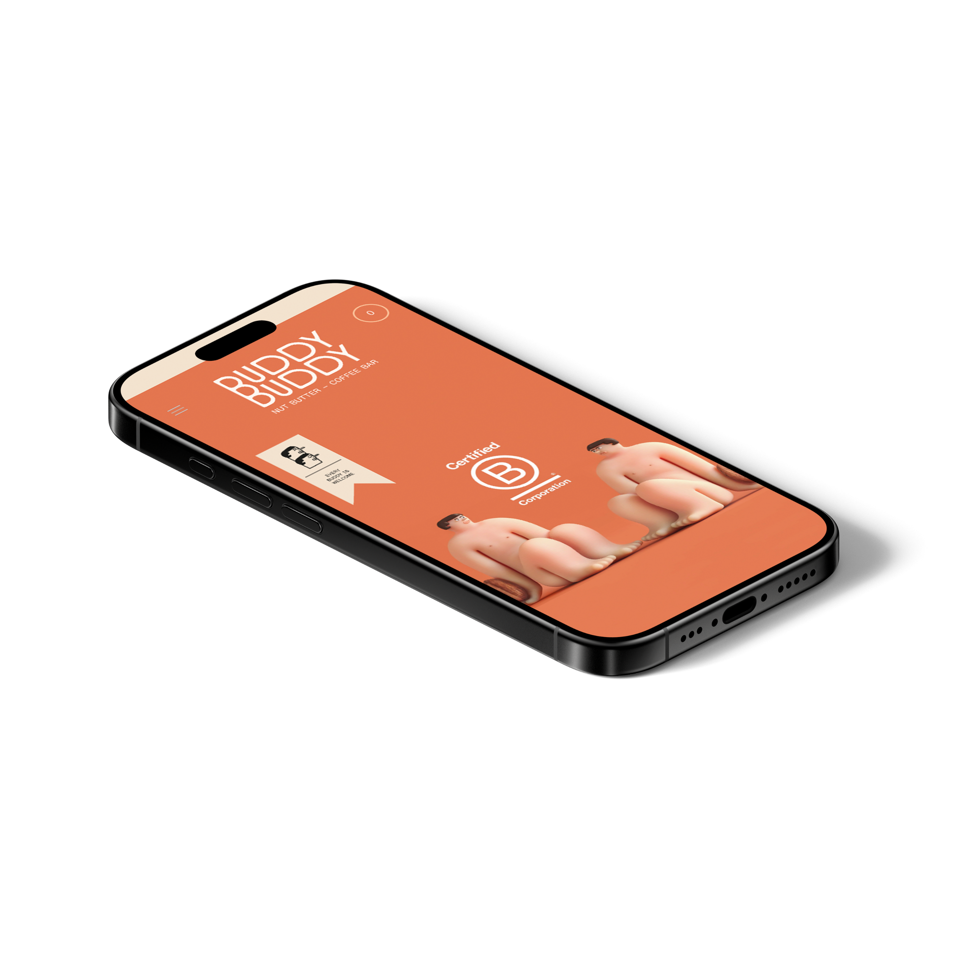
Mobile Responsiveness & UX Improvements
-
Redesigned or adjusted layouts so that on mobile:
• Navigation is collapsed cleanly (hamburger + well-structured dropdowns).
• Buttons / touch areas are large and easy to tap.
• CTAs remain visible without needing too much scroll. -
Improved readability: font sizes, spacing, image scaling.
-
-
Performance Optimization & Custom Features
-
Compressed images, used modern image formats where possible.
-
Deferred or removed non-essential scripts (e.g. animations, heavy visual effects) to reduce load time.
-
Optimized lazy-loading of product images / gallery images.
-
-
Enhanced Trust / Utility Features
-
Made “B-Corp” and values more visible (they have a “Promise → Achieving our B Corp certification…” section). Ensured this comes out in design. BUDDY BUDDY (EU)
-
Visible display of shipping policy, refund policy, payment options in footer and possibly elsewhere. BUDDY BUDDY (EU)
-
Location / café info prominent for local customers (“Locations: Brussels, Paris…” etc.).
-
Possibly custom pop-ups or banners for special offers, newsletter sign-up, or highlighting new products or upcoming popups.
-
Results Achieved / Expected Outcomes
-
Smoother User Journey & Higher Engagement
-
Users find what they want faster (product, stories, café info) because navigation is cleaner. Reduced drop-off in product and category pages.
-
-
Increased Conversion Rates
-
Stronger CTAs, better visibility of “Shop” and “Add to Cart” encourage more purchases.
-
More impulse buys via gift sets, featured flavors etc.
-
-
Better Mobile & International Sales
-
Improved UX on mobile increases mobile conversions.
-
Clear region / store prompts and localized info (currency, shipping) reduce friction for international customers.
-
-
Improved Load Times & Lower Bounce Rates
-
Optimized images & leaner scripts lead to faster page loads, particularly on mobile; reduces bounce, improves user retention.
-
-
Stronger Brand Perception & Trust
-
Cohesive design, visible values (organic / artisanal / B-Corp) create stronger emotional trust and brand alignment.
-
Customers are more likely to trust products, leading to more frequent purchases and possibly higher average order value.
-
-
Operational / Admin Efficiency Gains
-
With customized product templates, region settings, and organized menus, it's easier for the BuddyBuddy team to manage inventory, content, updates without errors or inconsistencies.
-


