
ellemora
Shopify Solutions Offered:
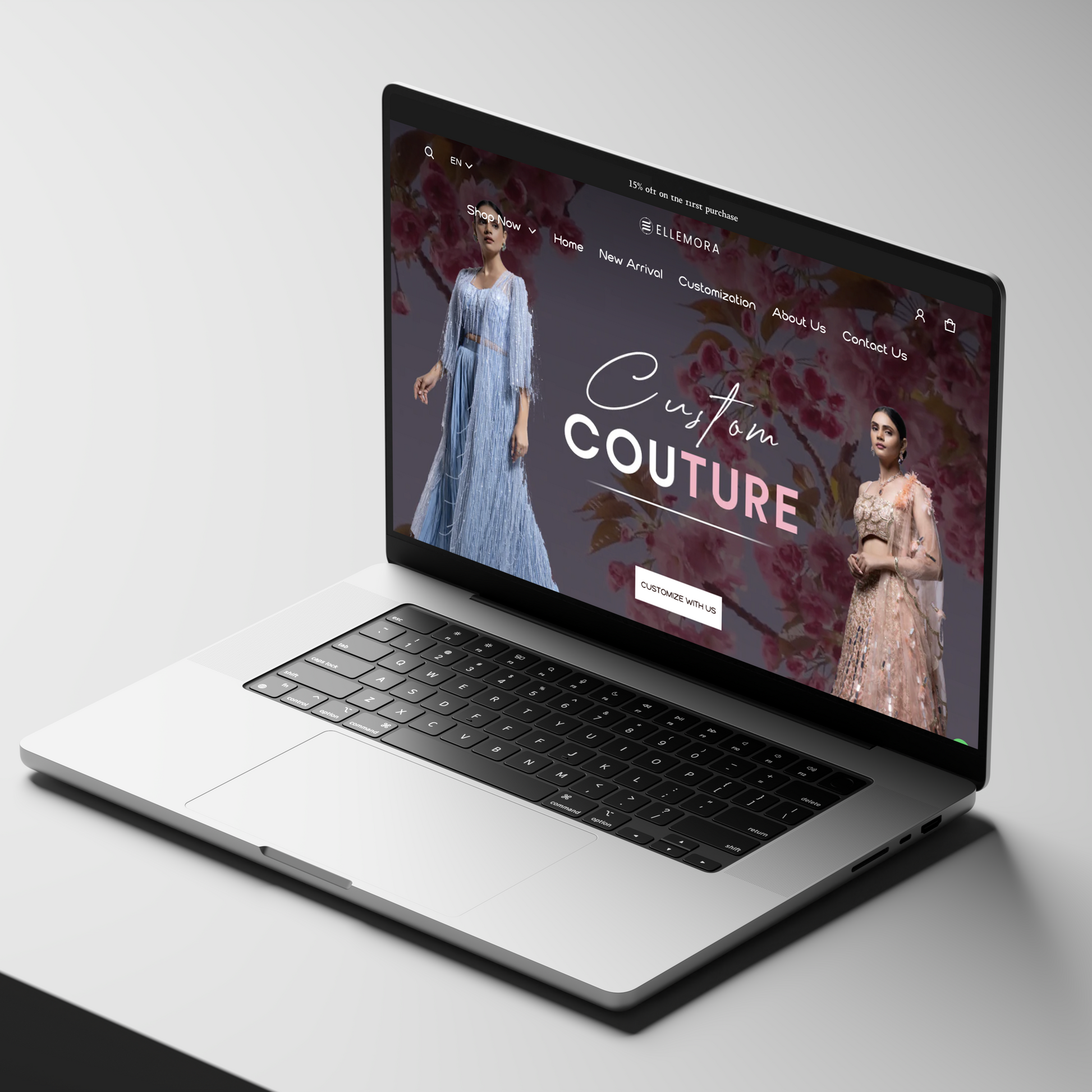
Challenges Faced by Ellemora
-
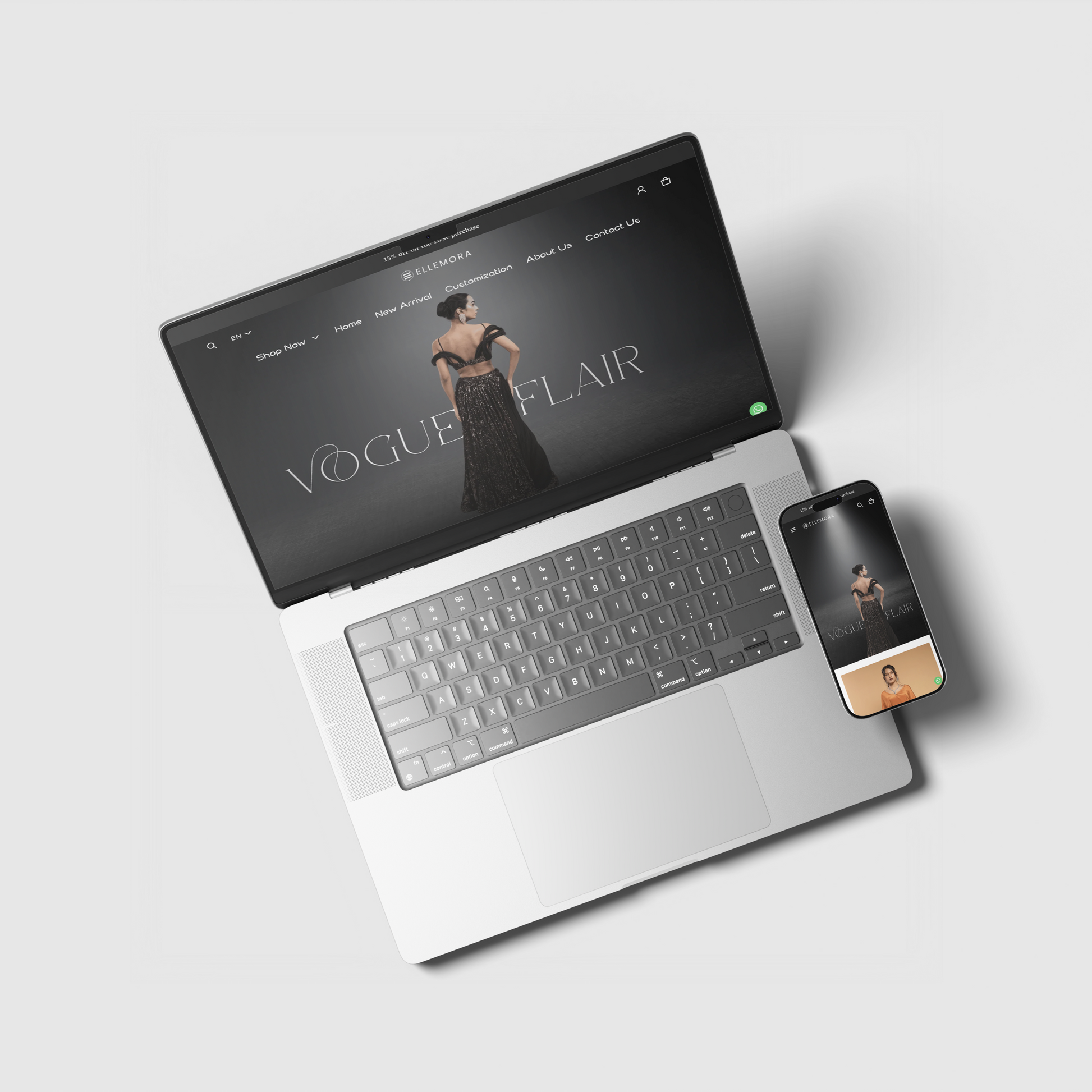
Clarity & Hierarchy in Navigation
The site has multiple product categories (Drapes, Dresses, Jumpsuits, Lehengas, Sarees, Modern Touch, etc.). Without a clearly structured hierarchy, users might struggle to quickly locate what they want. Multiple subcategories and imagery in menus may clutter and delay decision-making. -
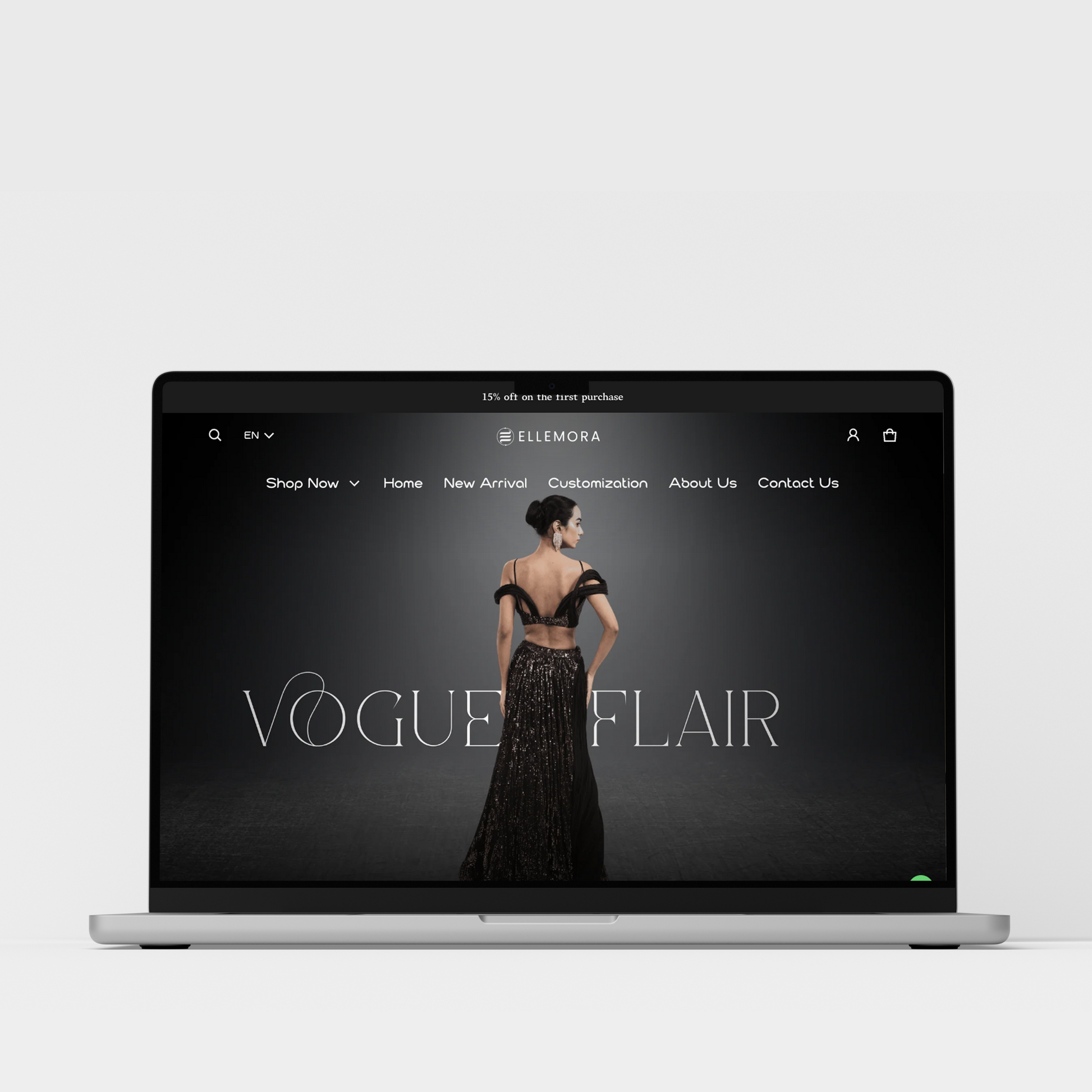
Brand & Visual Identity Consistency
Ellemora positions itself as a blend of traditional Indian craftsmanship with modern fashion. Ensuring that fonts, color tones, image styles, overlays, and visual messaging all align is critical — otherwise the brand’s message may feel fragmented or less premium. -
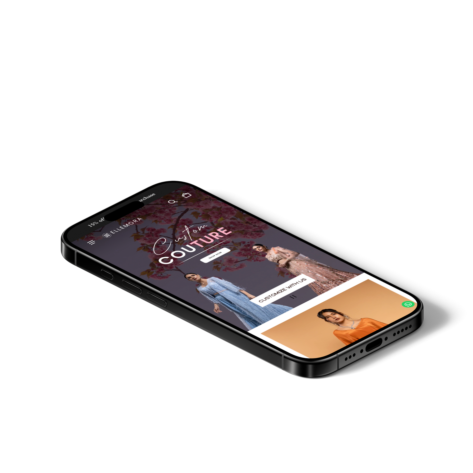
Mobile Responsiveness & CTA Visibility
On mobile devices, key elements like “Shop Now” or “View All” need to stand out. Ensuring buttons are large enough, spaced appropriately, and always accessible (especially when scrolling) is necessary. If not optimized, mobile users can get frustrated or abandon. -
Visual Load & Focus
There are many high-quality images, hero banners, best-seller carousels, etc. While visually appealing, they can slow page load or divert attention. Also, text overlays need to contrast well against background images for readability. -
Trust & Customer Assurance
Given the premium nature and relatively high prices, customers need cues around return policy, shipping, craftsmanship, payment options, etc. If these are not prominent, users may hesitate to buy.
Solutions Implemented by Pictonix
-
Navigation Design & Menu Structure Improvement
-
Organized main categories and subcategories more cleanly (e.g. “Shop Now” leading into product groups like Drapes / Dresses / Lehengas).
-
Used imagery in menu items (thumbnails) to help visually distinguish categories.
-
Ensured menu items are easily accessible and the menu is well-organized so users don’t get lost or overwhelmed.
-
-
Consistent Branding & Visual Design Language
-
Established a coherent typography system (headings, body text, overlays) that evokes elegance and modernity.
-
Unified color palette for buttons, text overlays, and banners so that each section feels like part of the same brand story.
-
Ensured product photography has consistent lighting, framing, and background so products shine without distracting background.
-
-
Responsive Layouts & Prominent CTAs
-
Designed the pages with “mobile-first” or “mobile-friendly” layouts so buttons / CTAs are easy to tap, visible without scrolling, etc.
-
Used “View All”, “Shop Now”, “Explore” CTAs in hero banners and category previews with good contrast so they stand out.
-
Ensured that best-selling product previews and promotional sections are well-laid out on smaller screens.
-
-
Visual Prioritization & Performance Tuning
-
Kept hero sections clean, with focus on key messages and images, avoiding too much clutter.
-
Optimized images (compressing, using appropriate formats) so that site load is faster.
-
Where possible, deferred non-critical assets so main content loads quickly.
-
-
Trust Signals & Helpful Information
-
Added sections (or made visible) features such as “Free Shipping”, “Handcrafted in India”, “COD Available”, “Gift Available” etc. to reassure users.
-
Ensured policies (Return / Refund / Privacy / Size charts) are accessible via footer or help menus.
-
Displayed customer support contact info clearly.
-
Results Achieved
-
More Intuitive Navigation & Lower Friction
Visitors can more easily find product categories; the organized menu and imagery reduces decision time and potential confusion. Likely a drop in bounce rates from product category pages. -
Stronger Brand Perception & Increased Professionalism
Visual consistency in fonts, colors, imagery reinforces quality and trust. Users perceive the brand as more polished and premium, aligning with its value offering. -
Improved Mobile Engagement & Conversion Potential
With CTAs placed more prominently and layouts optimized for smaller screens, mobile users have better chances of interacting (clicking through, adding to cart). Reduced drop-offs from mobile navigation pain points. -
Better Load Times & User Retention
Optimized images and better layout lead to faster page loads. Faster load improves retention, reduces bounce, and improves SEO as well. -
Enhanced Trust & Reduced Purchase Hesitation
Visible trust signals and help policies reduce anxiety around buying online (especially for high-cost items). This should translate into higher conversion rates, fewer abandoned carts, and more user confidence in completing purchase.


