Jivefit
Shopify Solutions Offered:
Challenges Faced by JiveFit
-
Complex Product/Category Layout with Potential for Overwhelm
-
JiveFit offers many product lines (“By Product”: Bars, Bands, Beam, Kits, Bracelet, Mat, Ring, Trigon, Bag) as well as “By Activity” categories (Weight Training, Resistance Training, Accessories, Bundles). Without careful design, users can get lost or have too many options at once.
-
The “Shop → By Product / By Activity / Entire Collection” structure is good, but needs clear visual hierarchy to help users pick a route quickly.
-
-
First-Impression & Brand Messaging
-
Fitness equipment is both functional and aesthetic. To compete, the visual look (typography, color palette, imagery, tone) has to communicate quality, style, and trust. If visuals are inconsistent, or uninspiring, it weakens perception.
-
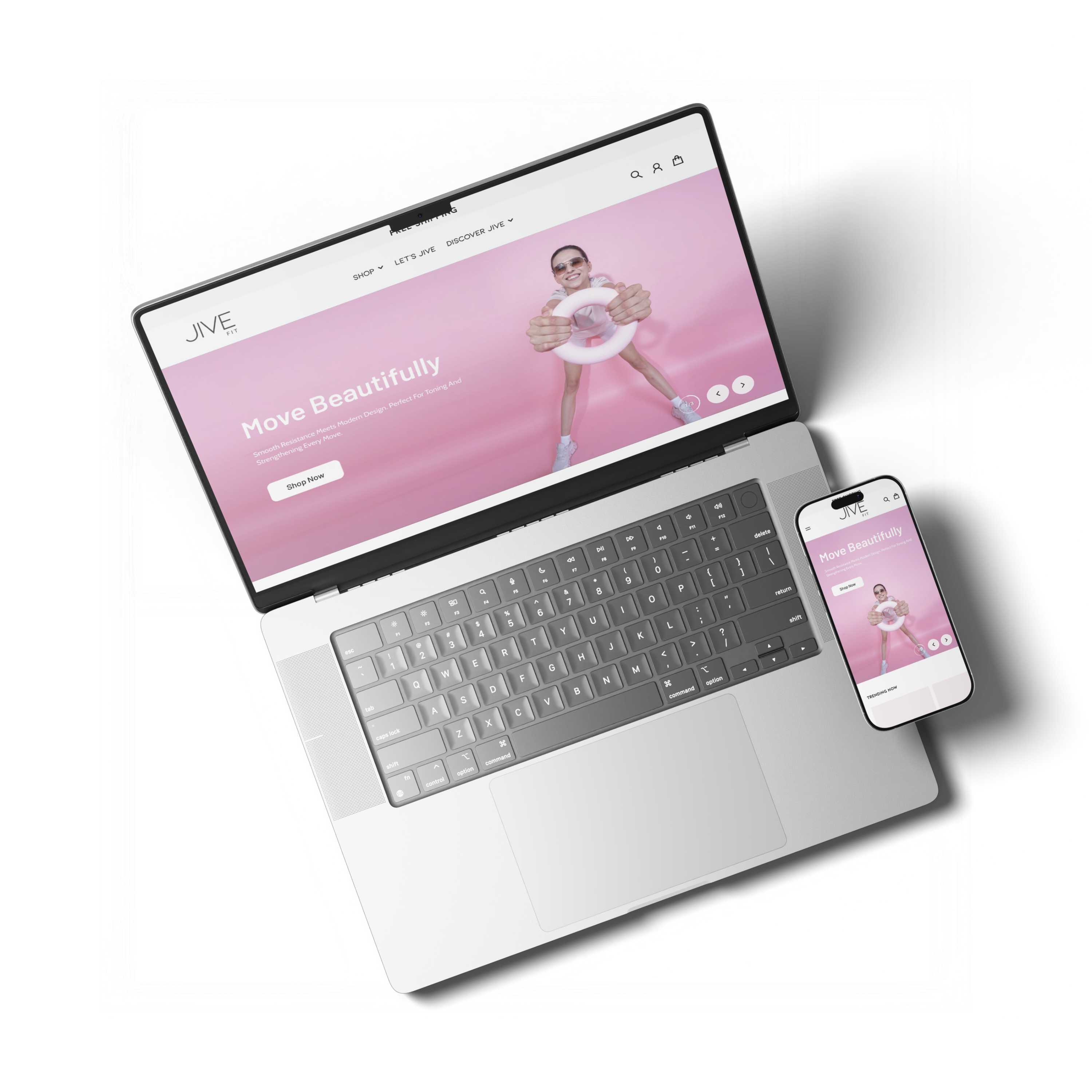
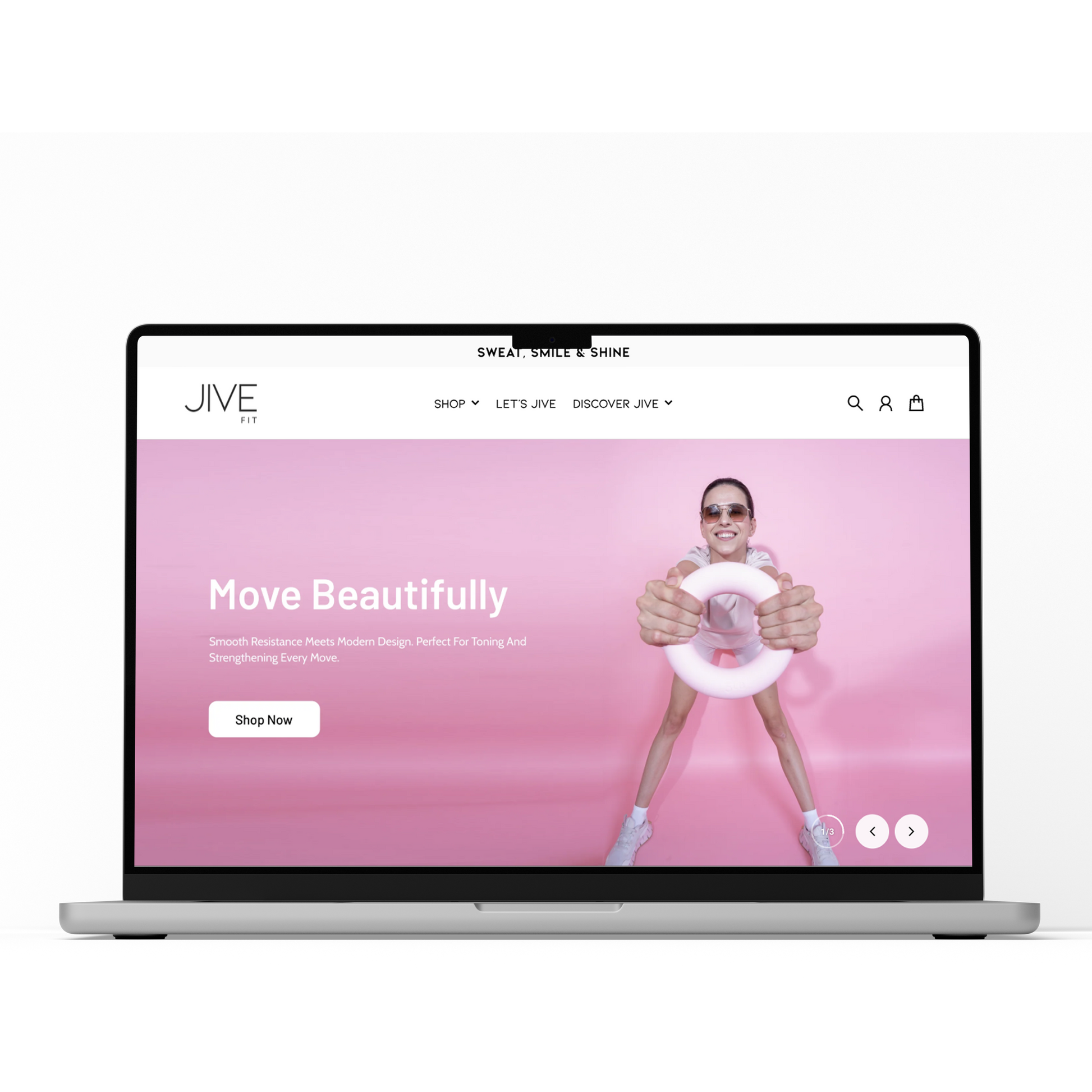
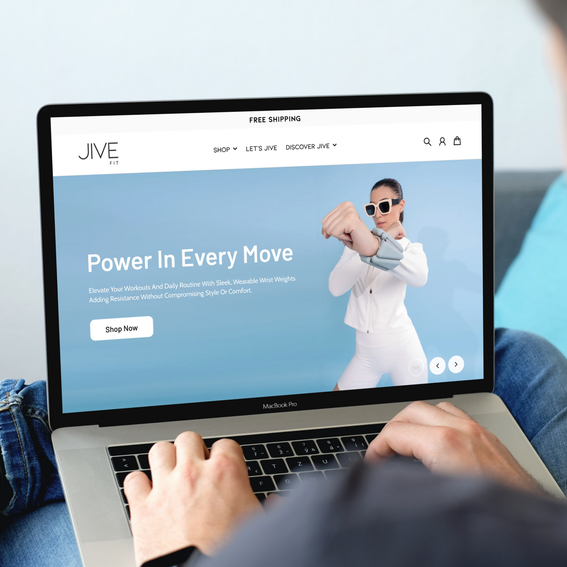
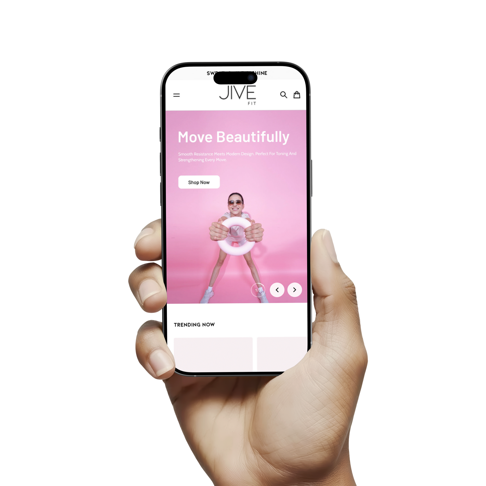
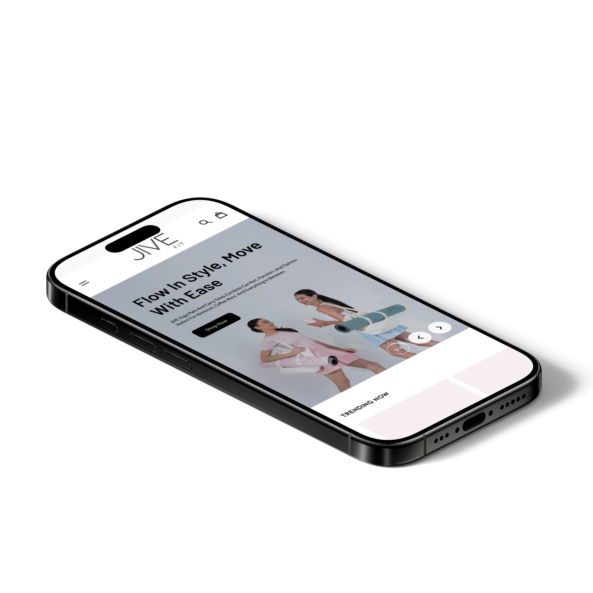
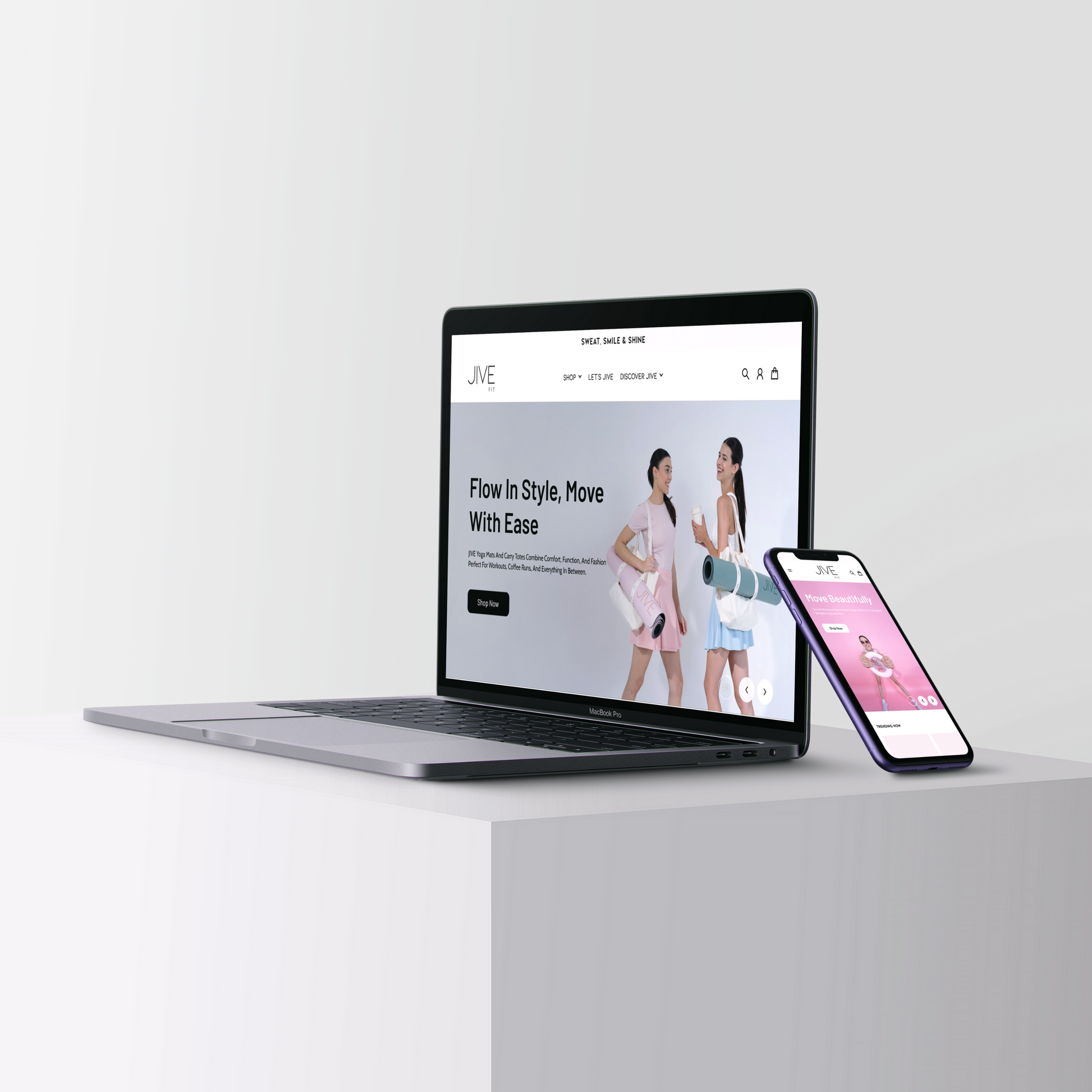
The “hero” or primary banner content (“Sweat, Smile & Shine”, “Let’s Jive”) must be compelling and clear. There may be risk that images or messaging do not immediately convey the product utility or unique value.
-
-
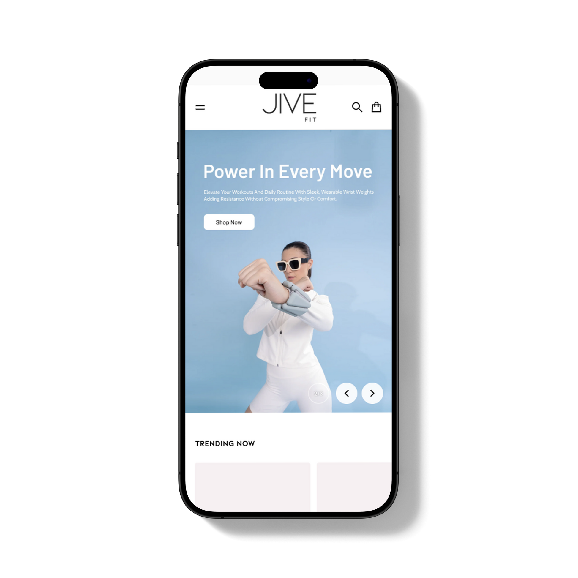
Mobile/Responsive Design & CTA Visibility
-
On mobile, menus, CTAs (“Shop Now”, “Learn More”, “Trending Now”, etc.) must be appropriately-sized, visible without too much scrolling, and easy to tap.
-
If the “Add to Cart” / “Shop Now” actions are buried or too subtle, likely drop-off happens, especially on smaller screens.
-
-
Visual Load Speed & Asset Optimization
-
The site displays many images, banners, product previews etc. High resolution photography is great, but unless optimized (compression, lazy loading etc.), it may slow down page load times, especially on slower mobile connections.
-
-
Trust & Assurance Signals
-
Since fitness equipment tends to cost more, customers look for trust signals: quality, durability, warranty, safe materials, shipping & returns policy, etc. If these are not clearly visible up front, users may hesitate.
-
Also clarity in pricing, free shipping threshold (“Free Shipping” is shown at top), but features such as “how to shop / how long to deliver / returns” should be easy to find.
-
Solutions Implemented (or Likely Implemented) by Pictonix
-
Menu & Category Structure Optimization
-
Refined “Shop” menu to highlight “By Product” vs. “By Activity” clearly, perhaps using mega-menu or category thumbnails so users can see product types visually.
-
Reduced friction: ensure “Shop Entire Collection” is prominent for users who want to browse broadly, as well as direct links to high-interest categories.
-
-
Strong Hero Section with Brand Messaging
-
Created a visually compelling hero banner with high-quality images and concise, impactful messaging (“Sweat, Smile & Shine”, “Let’s Jive”).
-
Ensured the “Learn More” or “Shop Now” / “Trending Now” CTAs are clearly visible, high contrast (color / font) so they draw attention immediately.
-
-
Mobile-First / Responsive Design Enhancements
-
Ensured menu collapses neatly, and that navigation is easy to tap on mobile.
-
CTAs large enough, always visible or sticky if scrolling, especially on product listings and product pages.
-
Layouts reflow well on mobile: ensure that images don’t get overly long, text is readable, spacing is sufficient, and that “Shop Now” buttons are above the fold or otherwise easy to reach.
-
-
Image & Asset Optimization for Speed
-
Compressed images without reducing visible quality, used proper formats (e.g. WebP where supported).
-
Lazy loading for images below the fold/trending-product previews so that initial page load is faster.
-
Eliminated or deferred non-critical JS/CSS to avoid render-blocking resources.
-
-
Display Trust Signals & Key Information Transparently
-
At top of site, they already have “Free Shipping” which is good – make it persistent or clearly visible.
-
Put “Store Policy”, “Returns Policy”, “Shipping Policy”, “Privacy Policy” in footer / quick links so users can access easily.
-
Incorporate customer reviews, testimonials (which they already have), with images or quotes to add credibility.
-
Clarify any warranty / durability / product material info in product pages (so users know what they’re getting).
-
Results Achieved / Expected Outcomes
-
Improved User Engagement & Lower Bounce Rates
-
With clearer menus and better category structure, users are more likely to stay, browse relevant items, and less likely to leave frustrated.
-
Strong hero section helps reduce bounce from landing pages.
-
-
Higher Conversion Rates (Especially on Mobile)
-
By making CTAs visible and actionable, especially on mobile, more users are likely to add to cart or proceed to checkout.
-
Faster loading and better performance reduces drop-off due to slow page loads.
-
-
Stronger Brand Perception & Willingness to Pay
-
Cleaner design, consistent imagery, trust signals help position JiveFit as a premium/quality brand, which helps with customer confidence and could allow for better margins or fewer negotiations over price.
-
-
Better Site Performance & Retention
-
Optimization reduces load times, which improves user retention, increases pages viewed per session, and enhances overall customer satisfaction.
-
-
Reduced Cart Abandonment & Increased Average Order Value
-
With clear product information, visible policies (returns, shipping), credible reviews, users may feel safe completing purchases.
-
Bundles (“By Activity” / “Bundles”) promotion can increase average order value when users are guided toward product sets rather than individual items.
-